Parallax – for an observer in motion relative to a set of objects, those objects apparent position will change in inverse proportion to the distance of the observer.
More simply: things far away move a little bit, things close move a lot.
Start by visiting the live example right here: https://whitelightninggun.github.io/Parallax-Study/
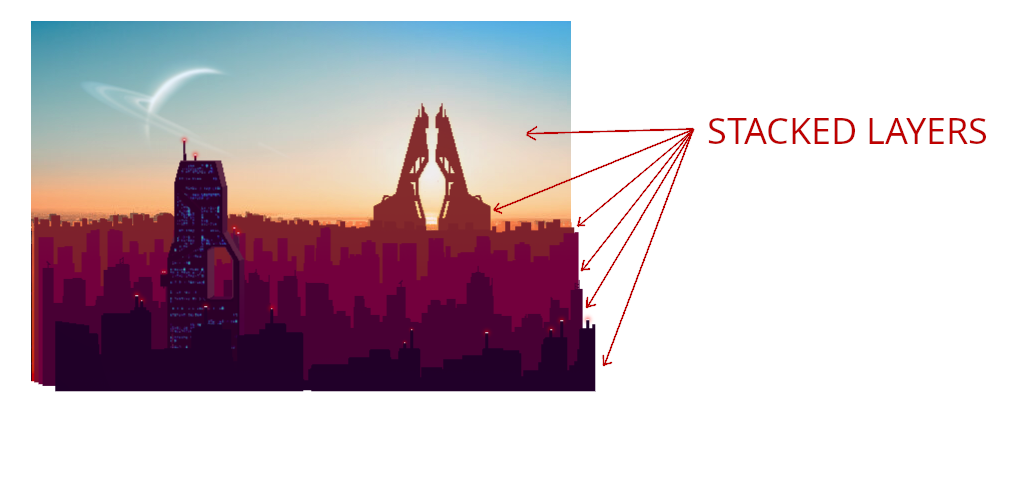
The parallax effect can be created by moving multiple stacked transparent layers at different speeds relative to an observer, or in my case, a mouse pointer.

In this case, the “highest” stacked layer, which is the line of dark purple buildings located in the foreground of the image, moves the most relative to the mouse pointer. The sky layer, which is perceptually the furthest away does not move at all in this example.
In the HTML the images are loaded in the following manner:
<div class="parallax-container">
  <div class="parallax-layer" id="layer0" data-speed="0">
    <div class="">
      <img src="images/pixelcity0.png" alt="" />
    </div>
  </div>
  <div class="parallax-layer" id="layer1" data-speed="0.25">
    <div class="">
      <img src="images/pixelcity1.png" alt="" />
    </div>
  </div>
  <div class="parallax-layer" id="layer2" data-speed="0.2">
    <div class="">
      <img src="images/pixelcity2.png" alt="" />
    </div>
  </div>
  <div class="parallax-layer" id="layer3" data-speed="1.2">
    <div class="">
      <img src="images/pixelcity3.png" alt="" />
    </div>
  </div>
  <div class="parallax-layer" id="layer4" data-speed="2.8">
    <div class="">
      <img src="images/pixelcity4.png" alt="" />
    </div>
  </div>
  <div class="parallax-layer" id="layer5" data-speed="4.3">
    <div class="">
      <img src="images/pixelcity5.png" alt="" />
    </div>
  </div>
  <div class="parallax-layer" id="layer6" data-speed="5.7">
    <div class="">
      <img class="layer6" src="images/pixelcity6.png" alt="" />
    </div>
  </div>
  <div class="parallax-layer" id="layer7" data-speed="9">
    <div class="">
      <img class="layer7" src="images/pixelcity7.png" alt="" />
    </div>
  </div>
  <div class="parallax-layer" id="layer8" data-speed="0">
    <div class="">
      <img
        class="top-layer"
        src="images/pixelcity-topA.png"
        alt=""
        id="top-layer1"
      />
    </div>
  </div>
</div>
We have used the data-speed attribute to precisely control each layers movement speed. You will see the JavaScript in a moment. The highest layer, id=”layer8″, has a special property which will be discussed at the end.
The CSS classes are designed to super-impose each layer on each other using the usual technique of relative positioning for the parent layer and absolute positioning for child <img /> elements:
.parallax-container {
  position: relative;
  height: 50vw;
  width: auto;
}

.parallax-container img {
  position: absolute;
  top: 0;
  left: 0;
}
Things are nicely set up at this point to actuate the position of each layer with a JavaScript for-loop:
let top_layer = document.getElementById("top-layer1");
let width = top_layer.offsetWidth;
let height = top_layer.offsetHeight;

document
  .getElementById("top-layer1")
  .addEventListener("mousemove", function (e) {
    let rect = this.getBoundingClientRect();
    let x = e.clientX - rect.left; // x position within the element top-layer1
    let y = e.clientY - rect.top; // y position within the element top-layer1
    let relative_X = -width / 2 + x;
    let relative_Y = -height / 2 + y;
    let layers = document.getElementsByClassName("parallax-layer");
    let speed, xPos, yPos;
    for (let index = 0; index < layers.length; index++) {
      speed = layers[index].getAttribute("data-speed");
      xPos = 0.006 * relative_X * speed;
      yPos = 0.006 * relative_Y * speed;
      layers[index].children[0].style.transform =
        "translate3d(" + xPos + "px, " + yPos + "px, 0px)";
    }
  });
The final piece is the layer8 element. This is a transparent and empty png with a size big enough to encompass the underlying layers. It is held static over the underlying layers using data-speed=0 and serves as a basis on which to apply a CSS border element 40 pixels thick that hides the rough edges of the underlying displaced layers.
Thus completes my 2-dimensional parallax effect.

