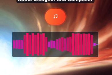
A client of mine wanted a clickable gadget on his WordPress homepage that could be used
to control and play a piece of music that he wanted to feature. Visually speaking he wanted
it to somewhat resemble the travel bar you see on websites such as SoundCloud, but
to fit quite neatly into his currently existing homepage theme. Here’s how I did it.

Begin by starting a new python project in a text editor of your choice and import the
following modules.
import wave
import numpy as np
import drawsvg as draw
We will start by reading the audio data in the music file into an object of the wave library. I could only get this to work with .wav files.
BAR_COUNT = 60 # sets number of bars in chart
X_WIDTH = 300
Y_HEIGHT = 80

wav_obj = wave.open('Songname.wav', 'rb')
sample_freq = wav_obj.getframerate()
n_samples = wav_obj.getnframes()
signal_wave = wav_obj.readframes(n_samples)
signal_array = np.frombuffer(signal_wave, dtype=np.int16)
The constants BAR_COUNT, X_WIDTH and Y_HEIGHT define key parameters of the svg file we will generate later.
The variable ‘sample_freq’ quantifies how many times per second a track takes a “snap-shot” of a given sound wave, and ‘n_samples’ quantifies the total number of these “snap-shots” in the file. It stands to reason that if your sampling frequency is 44.1 kHz, and your piece of music if 100 seconds long, then you will have about 4.41 million samples in your audio file. From this we can derive the time length of any track based on it’s sampling frequency and number of samples:
t = n / f
Where n is the number of samples and f is the sampling frequency in hertz.
On line 11 we define ‘signal_wave’, which a bytes array that expresses every slice of audio data in the track as an 8-bit hex number, this is then passed to a numpy array of 16 bit integers, which halves the length of the array.
Next, we split the audio channels into left and right respectively, using a numpy operation:
lc = abs(signal_array[0::2]) # lc denotes "left channel"Because accuracy is not important here and this is not a serious exercise in digital signal processing, for the remainder of this demo we will only be using the left channel. Also, you may wonder why I have used the abs() command. This is because sound waves are oscillatory and are defined in digital signal processing in terms of negative and positive numbers; any average amplitude over a period of time is likely to be close to zero, which is not very interesting. By setting all the numbers to positive, we can perform a regular arithmetic mean.
If you’re curious regarding how the average power of an audio signal is quantified more rigorously, try reading this.
Now, we will take the ‘lc’ array and derive a kind of “average value” for every 60th part of the array. These average values will be used to quantify the height of the rectangular bars that will characterise our final svg graphic.
Let’s define the number of sample elements that will go into a sample bin:
bin_size = len(lc)//BAR_COUNTWe intend to take the l_channel array and derive a kind of “average value” for every 60th part of the array. These average values will be used to quantify the height of the rectangular bars that will characterise our final svg graphic. To that end we define a new array that splits up l_channel into 60 sub arrays each containing about the same number of elements:
lc_subarrays = [lc[i:i + bin_size] for i in range(0, len(lc), bin_size)]This is a one-liner that Python lends itself well to, and it creates a number of sub-sets from the lc array, from which we can iteratively take the arithmetic mean.
result = [sum(i)/len(i) for i in lc_subarrays]Next, we normalise the results to range from 0-80 by multiplying them all with a coefficient.
normalisation_factor = Y_HEIGHT/max(result)
normed_result = [i*normalisation_factor for i in result]
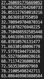
If we print the results to the terminal we will see something like the following:

Now we can draw the image using the ‘drawsvg’ library.
# Drawing the bar graphs

d = draw.Drawing(X_WIDTH, Y_HEIGHT, origin=(0,0))

width = 5
x = 0
max_height = 80


for i in normed_result:
    val = round(i)
    d.append(
         draw.Rectangle(x+2,
         (max_height - val)/2,
         width-2,
         val,
         fill='#FF0078')

    )
    x += width

d.save_svg('pink-waves.svg')

print("finished")
This will draw a collection of vertical magenta coloured bars with a height that reflects the loudness of the audio track at any given point along the horizontal axis.

There’s endless scope for creativity by using gradients and varying colours, width and shapes.

